Logo
The primary logo and its usage rules. Maintain clear space around the mark and never distort or recolour it outside the approved palette.


Wordmarks & Lockups




Type
Typography selections for headings, body copy, and UI elements. Consistent type usage reinforces brand recognition.
abcdefghijklmnopqrstuvwxyz
ABCDEFGHIJKLMNOPQRSTUVWXYZ
0123456789 !@#$%&*()?.,:;
abcdefghijklmnopqrstuvwxyz
ABCDEFGHIJKLMNOPQRSTUVWXYZ
0123456789 !@#$%&*()?.,:;
Colour
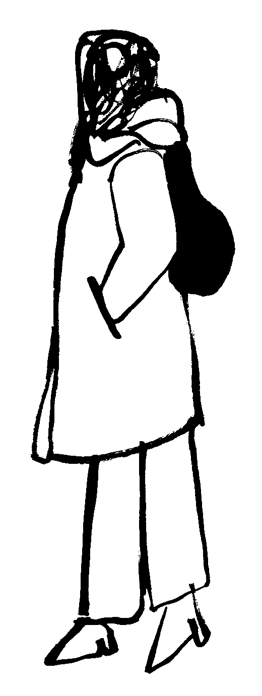
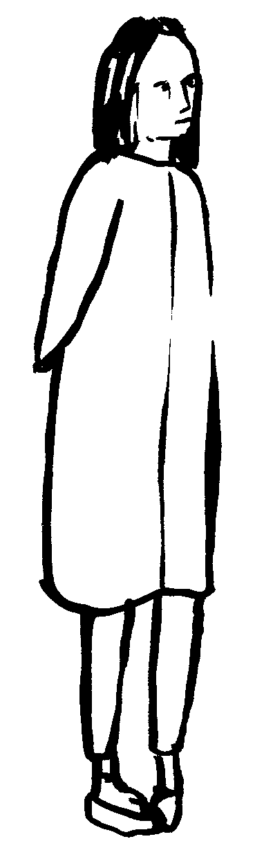
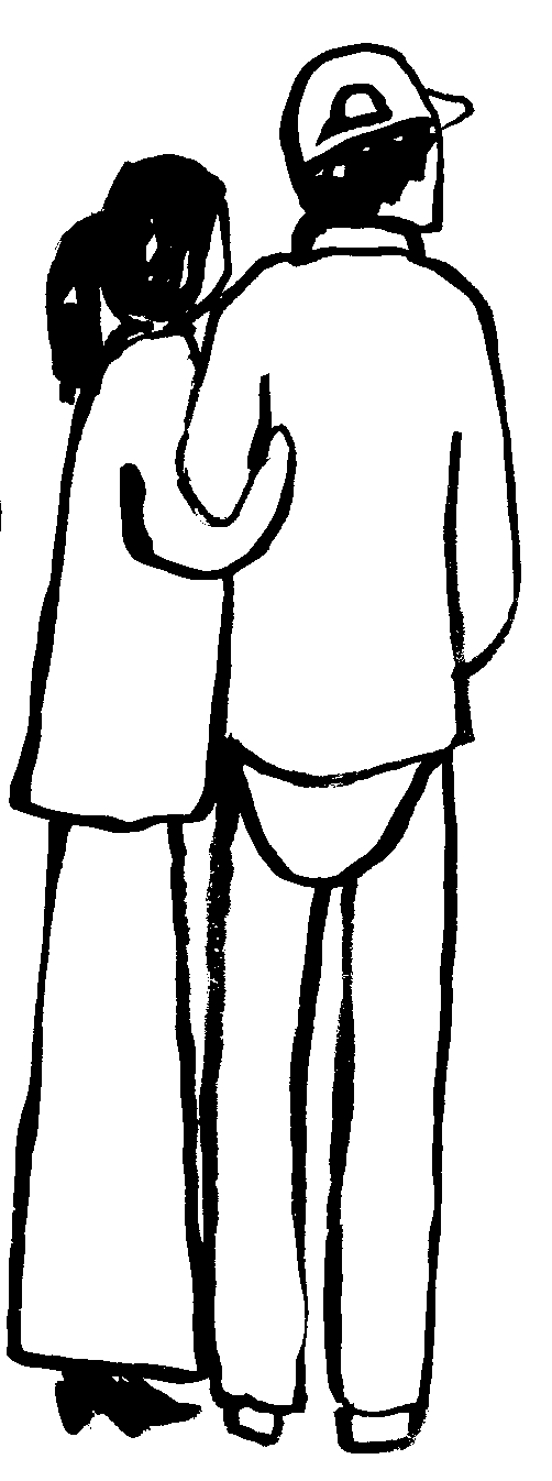
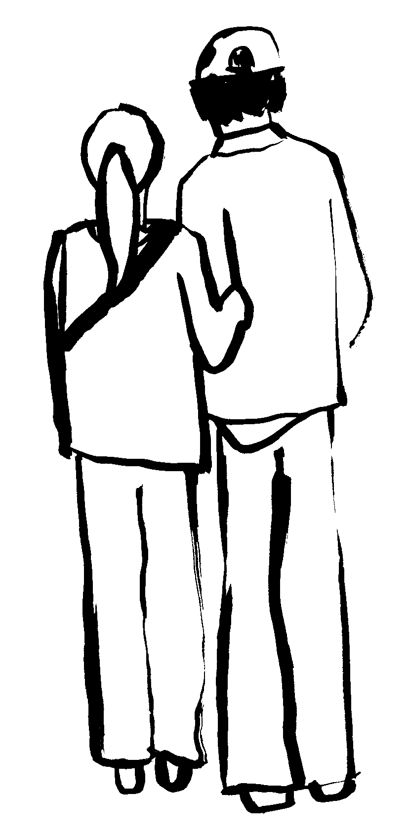
Illustrations
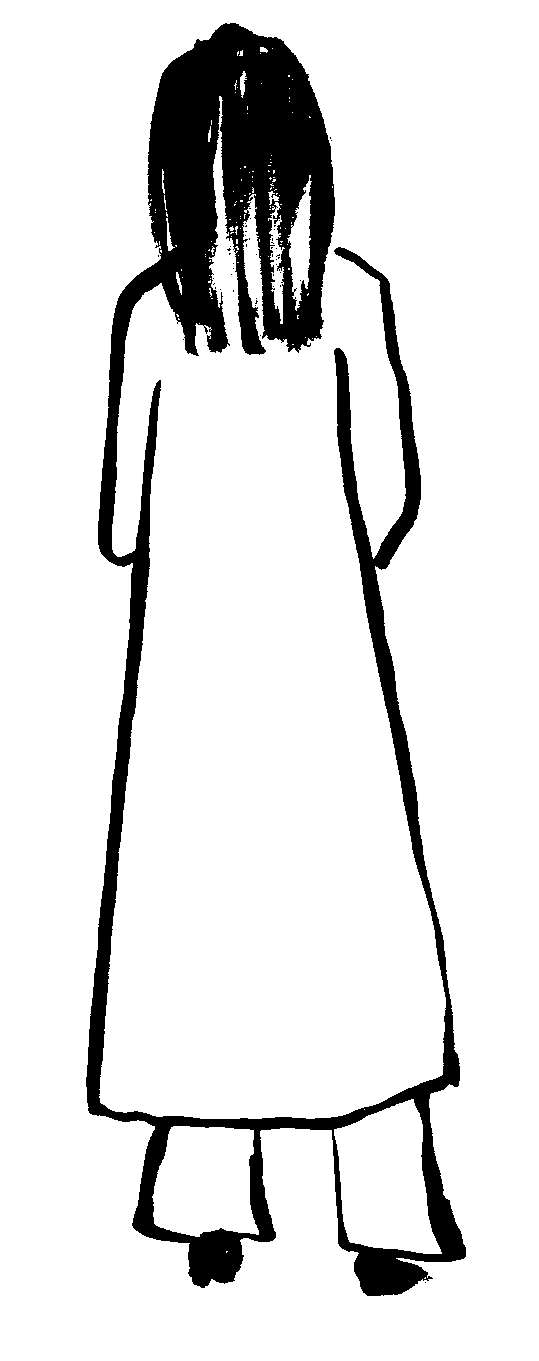
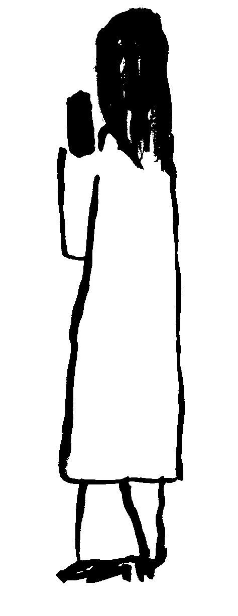
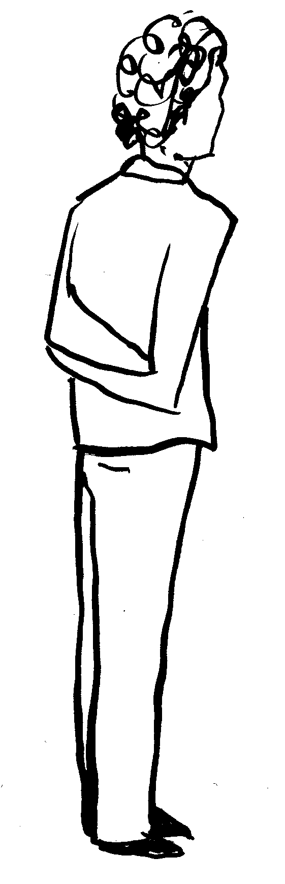
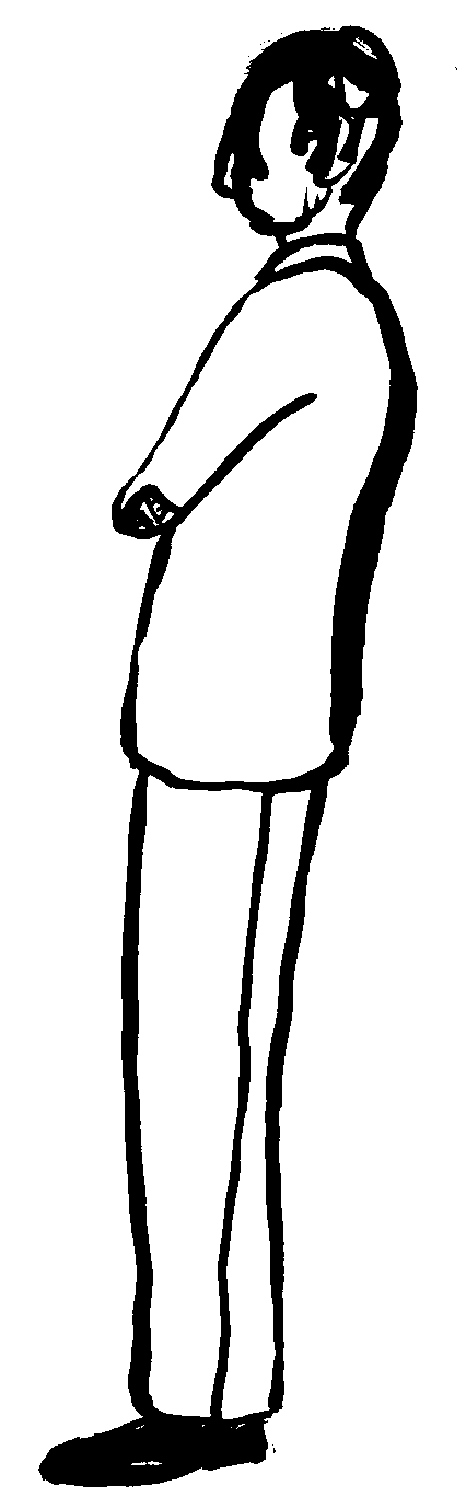
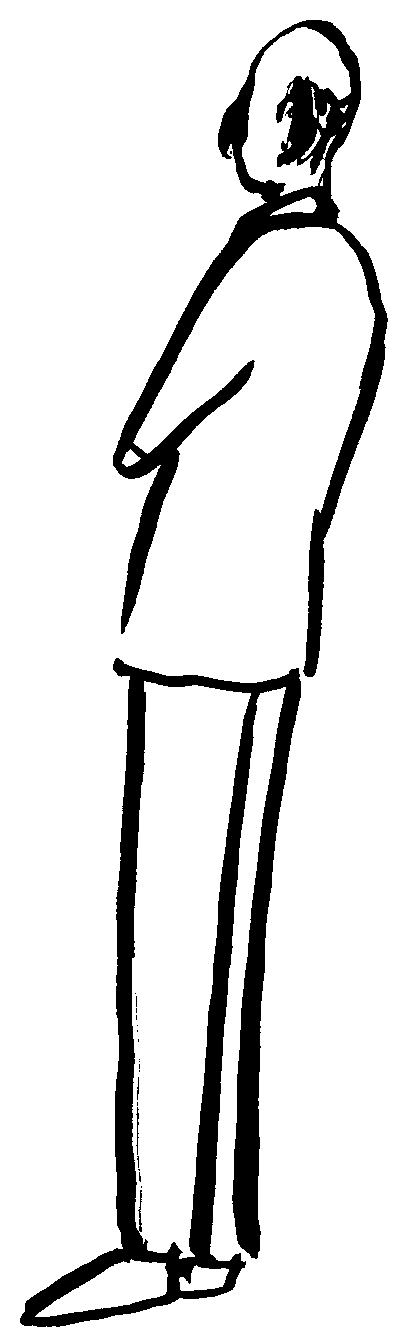
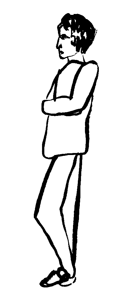
Illustration style, motifs, and guidelines for creating on-brand visual assets. Keep linework consistent and use approved colours only.
Application
The examples below demonstrate how the brand elements defined above combine to create a recognisable identity. A key characteristic is the playful interaction between illustrated figures, imagery, and typography. Equally central is the generous use of negative space — celebrating art by making it the hero, framing it without competing with it.